Wednesday, 30 November 2011

Quick sketches for Knole House

Hmmm, it's been a while since my last confesion......I mean update.  The images below are my initial sketches for ideas improvements to Knole House, The Walled Garden.  This is part of work of the ongoing CMP through 'Historic Garden Conservation' module.  Some ideas are to improve the existing management areas such as the Wilderness.  This area in particular already had an CMP in place after the great storm of 1987, when most of the Wilderness had to be re-planted.  However the present Sackvilles have become attached to the wildness of the plantation, yet if they were to leave it as it is, the trees will almost certainly strangle eachother over the next 5 years or so.  The area needs to be thinned and maintained properly.

Other ideas are to create an entertaining space where the Sackvilles regularly use, which both is inkeeping with the house, but forms a 21st century stamp of there own on the gardens.  My initial ideas are quite formal and I think some development is necessary, but I think the introduction of formal trees and a rill is warming up my creative juices.  I also want to introduce tree planting acroos where the herbaceaous borders are now.  The space inbetween rises steadily up to the wall gateway.  This I would like to terrace in the form of deep steps.  This will create a view point and direction through the garden where at the moment it is lacking.

As I define my ideas more (and improve my sketch communication!) I will add them to the blog


Sunday, 23 October 2011

Ooops....I'm on catch up!!

Although I have been doing the work, my blog updating has been a little laps as late.  So here follows a number of exercises with conclusion and analysis!

The first experiment is the colour swatch wotsit.  I created 16 squares and filled them with promarker colours, one sheet on trace and one on paper.  Then got them both scanned on my A4 scanner and then re printed both on my printer.  For anyone who is interested I use at home an Epson Photo PX700W, which is a scanner/printer combination.  Great at scanning most things although I sometimes find scanning gloosy pages causes shimmering across the image.  I'm sure there is a way of controlling that, but yet to find out.  The printer side is excellent for photo quality imagery, however this thing takes 6 individual cartrideges costing just over £50 to replace the set.......and they be disappearing fast my friends!!!


Anyway.....away from the boring stuff, here are my results.  (The top selection) The colours originally on paper have tended to come out a little duller; less vibrant to the pen colour. (The bottom selection) The colours here also came out duller but from the trace have a kind of silvered finish when you see the whole set of colours together.
....is anyone bored yet!  I think the one thing I have learnt from this is to realise that you have to experiment with your medium and your output everytime you change something.  IE you need to test print from every printer you use and compunsate accordingly.  I would advise sending your swatch to Uni printers and Media Tech.

Right that's that out the way.  Here are my pretty photoshop pictures produced from the paper model exercise.


I thought I was being clever using my own photos as I new the quality was good, but I didn't bank on how bad print is from a Sunday magazine.  If you don't balance up (or down as the case may be) the qualities in each component of your picture it simply looks crap!  I would encourage everyone to start creating a library of your own photography of people, skies, trees etc (that you shot on your own cameras I mean), to make life a little easier.

The other little touch I have picked up is to soften the edge of the shadows just a little.  This makes them look just that little bit more realistic than just thinning out the opacity.  Cheers for that Dom.

This bucket filling within a trace outline, I forgot I hadn't put on the blog.  Not sure if I really understand the point of it as a repeating pattern looks RUBBISH, so why would you use it????  I did have trouble sampling my own sample as I have Version 7 of Photoshop and can't seem to get that technique to work, but I know there is a way of doing it.   So if anyone knows please let me know.  Anyway I used the existing patterns saved on the bucket fill already.  I sampled each section of my shape on different layers in order to change the balance and contrast to give an effect of shading.  Looks a bit like software from the 90's, but hey, I tried.

Here are my results

Ok......I think this is the last thing for now, but I have more to add on soon.  This is my DYNAMIC COMPOSITION.....although I use the word dynamic loosley!!!   I experimented first on powerpoint with some smaller images, just to arrange roughly and find out what worked well.  Then I took the best composition and repeated it in Photoshop.  I mucked around with the colours to balance up the 4 images, because as they stood they had no linking qualities and looked on next to eachother no matter where you put them on the page.

Messing about with the hue and saturation, the effect reminded me of a process in photography called cross processing.....back in the days of film which of course shows my age some what.  Cross processing was when you developed colour negative film in a transparency (slide) film process or visa versa.  The reults would give you this kind of psychedelic finish.  So 'Cross-process' became my word to connect these images.  Unfortunately, I don't think anyone else will get it and my placing of the text is quite boring.  So even though I printed this up as A1.......I aint happy!  So after consulting with Lissy last week about using the word 'Curiousity' which was my original idea but I'd shelved it, I have come up with another option.  As all the figures are looking into my model or being 'curious about them, it does seem an obvious outcome.  Let me know what you think........I'll find out soon enough as it's Monday Crit tomorrow!!!!!!
Here are my efforts......


Sunday, 9 October 2011

Scanned outline of paper model image

Ok, this task I found really easy!  I printed out the photo of my model, traced the outline and scanned it black and white 400 dpi.  It came out ......and well, here it is below.
Next blog will show the photoshop images which will be in the crit tomorrow.  I'm quite pleased with them and I did keep to the time allocated........kinda!!

Friday, 7 October 2011

Paper Model Exercise

Well I did start the day with positive mental attitude, but I have still come away thinking all I'm good for at the moment is a job on Blue Peter.  And it seems my creativeness isn't getting much better either seeing as I was Mr. Predictable when it came to where I should put a dot in a bleadin hole!!!!  Lets hope I get better at that!

Anyway, I did have a much better day today and feel a tad more positive.  Below are my four models which I photographed at home.  Such master pieces!!!!
Complexity

 Texture, Touching, Contrast
Symmetry, Elegance, Ugliness

Punctured, Planar, Dynamic
So......off to attack the montage in Photoshop.  Good luck with that everyone!


Quick 2 Minute Sketches

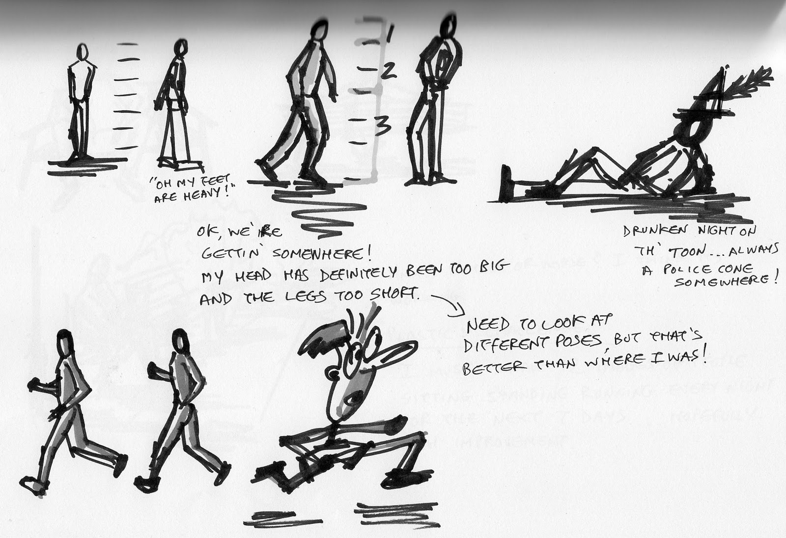
It has come to my attention that I draw alien figures!  After doing the quick 8 sketches in different medium I noticed that my little men look a little odd!  Large egg heads and legs way too short......must experiment!!!

As for the medium I've used I think I prefer using the pro markers, certainly for quick sketch work anyway.  Nice bold lines that will be able to be seen from a distance and the one or two colour rendering will highlight hard and soft materials quickly.

As for the rest, well I think rollerballs work much better than fine liners as they flow better when you scribble.  The dry pastels and charcoal are too messy for sketch work and really don't work when you are drawing small images.....I kinda thought that would be the case.  The pure graphite works well as you can create tonal quality very easily.  The water colour was actually watered down gouache, but does the same job.  I think you can create some great effects with watercolour so long as you keep it simple.
Figure experimenting.....
...I think I'm getting there now, but must keep practicing.  Just need to be more confident about the lines I am making and a few more sketches in different positions will go a long way I think.  If anyone has any comments, please let me know.


Sunday, 2 October 2011

Get the mind in gear!!!

Ok.....tomorrow is another Monday and I am going to try and be positive right from the start.  I will not feel sick with worry that I'm pance, I will be positive and I will be creative......  I've been working on my sketch drawing tecniques and I will try and put them into practice.  I will forget about the fact my car keeps cutting out and leaving me stranded on the hard shoulder of the A2 and I will forget that I haven't done work towards my presentations for Tom or Marian......thats what Tuesday and Wednesday is for!

I AM INVINCIBLE!!!  POSITIVE MENTAL ATTITUDE!!!

And just to get you in a good mind set, here's a little awarness test.  For people who have seen this before I apologise, but if not, enjoy.  I first saw this at a 'positive mental attitude' group bonding corporate thing.

You must watch carfully the number of passes that are made by the white team.  Remenber to concentrate!
Click on the link
http://www.youtube.com/watch?v=uonJ0Any7Y4&feature=related

Tuesday, 27 September 2011

Day 1. This is where it begins!!

Well, I don't know about anyone else, but 'Day 1' has been a bit of a shock to the system.  It has definitely highlighted where I need to improve, but if I'm honest about it, I already knew that.  I've been hiding away from my weaknesses and now I have no option but to tackle them head on.  My head has alot to do with everything by the sound of it, as I am obviously a thinker!  I did admit that at the start of the lecture, but I didn't realise how that was going to effect the task in hand and of course my future as a designer.

I discovered that everything I did know I didn't put into practise for this exercise, perhaps I was not quite ready to get back in the swing of things.  Anyway, below are the results of my efforts and as you can see 'objectively' I failed the task as I only produced 2 images.  Subjectively, I had a good idea, but spent to long thinking about it and therefore was unable to communicate the design.  I think I need to concentrate on drawing out ideas when they enter my head and scribbling notes with them.  I also need to find a sketch technique which I am happy with, that is quick and effective.