Friday, 30 December 2011

Eastbourne A1 1:2000 sketches

Well......I'm back posting sooner than I thought!  I thought I'd show you my three 1:2000 for Eastbourne as typically I have been having doubts about the choice I made!  Well I said 'have', but after studying them as was advised, I think I had made the right decision.

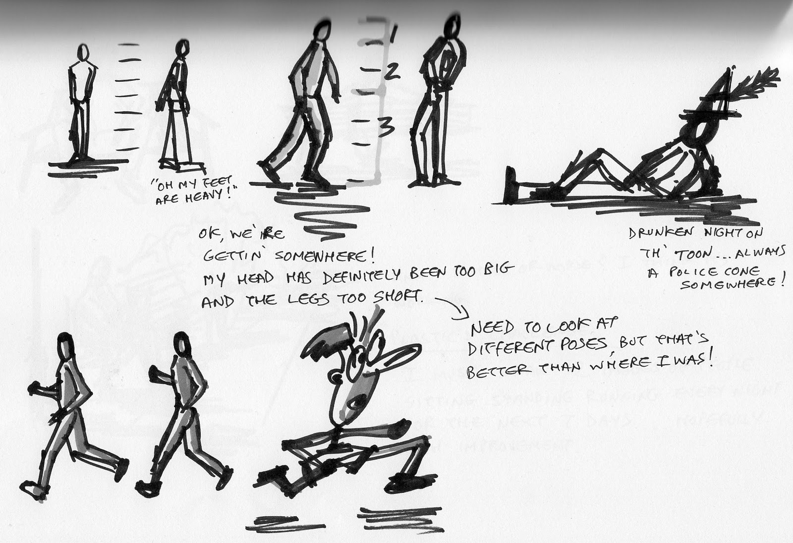
Anyway, enough waffle......first up is 'Playful'.  Undoubtably the word which I initially thought would be the most inspiring and in all honesty I think I had already decided I would choose this design, before I even got anything on paper.  I wanted to produce something that was playful without being tacky or 'Disney' like, as I think this would be some peoples response.  It's not just about creating a quirky childrens playground.  In fact it is not necesarily about children.  I'd say 'playful' in the way I see it is more about it's opposites.  In that I mean like I mentioned in an earlier post; something which is unrestricted  and informal.  A space that is accessible to all and enjoyed by all, which of course is not as easy as it sounds.....and I'm sure none of these categories were ment to be easy in the slightest.

So the elements which you can see here are things like the lighting.  Instead of  the main promenade lighting being permanently illuminated, they are movement sensored as in many modern offices today.  When you enter a room the lights come on, when you leave the lights go off.  As you walk the promenade the first three lights say, come on in front of you and then switch off as you pass them.  This creates a visual experience for the individual, an interactive piece of art seen at a distance and of course an appreciation of sustainabilty which we all should be involving in all new design.

Other playful elements which you can see are an outdoor gym, running in an area of woodland .  This can be utlilised by anyone wanting to keep fit.  It could be incorporated into private fittness classes or by the Sovereign Leisure Centre.  Essentially depending how hard core the individual is, it could be used all year round.

There is a geyzer shooting water from the centre of a new pier.  This was inspired by St. Mary's Lighthouse in Whitley Bay, Tyne and Wear where I grew up.  The lighthouse is situated on a small rocky island (as you would expect!) The pressure of the sea pounding into the rocks over time eventually find cracks that lead to the surface and shoot the pressured water with every wave.  This used to entertain my friends and myself for hours....until the tide came in and we were forced to pedal our bikes across the course way through 2 foot of water!

So sculpture was another element, but I found myself designing something which just had a number of instalations plonked on the site.  And although giant wind turbines excited me and curled up stone structures of the ground ripped up by the wind sounded quite fun, I think I was heading towards the type of design I initially wanted to avoid.
'Playful'

The second scenario was 'Connective'.  Now again I have found elements of this design interesting and was hugely inspired by the river front of Bordeaux when thinking about this design.

After visiting the city in the summer, I came away constantly thinking, why don't we do things like this in Britain?  They have an old city which is heavily pedestrianised and successfully interlocked with new developments.  A park and ride service which ferries the public from outside the city using an electric tram.  The tram stores electricity as it travels outside the city via overhead cables, enabling it to run without any cables or electrified rails within the city.  A clean and safe system which costs about 3 euros a day to park and use the trams!
 Bordeaux tram service running parallel to the river


 Bordeaux tram service leaving the station near the river, and situated in the cover of trees.  The space was formerly a car park.


The promenade along the river bank is designed to allow walkers, joggers, skaters and cyclists all to use the space.  A simple change in ground surfaces is all that is needed to separate pedestrians from those on wheels.  The path for bikes etc is a smoother resign finish, whereas the footpaths are rougher resign surface.  There was no need for great big signs everywhere to explain this either.

The footpath and cycle path of Bordeauxs river front


 Along different sections of the river development, which was a few kilomtres long, the designers had thought about something for everyone.  There are planted areas with seating, sports areas, versitle areas for markets and exhibitions, restaurants and shops, hidden parking and of course the transport links from the centre of the city to the river.  All in all I was very impressed.  Not only that the work only took a year to complete.

With the Eastbourne site I tried to encorporate a number of theses design concepts.  So there is a sports area, an amphitheatre, and an area for markets and even a tram system linking Eastbourne to Sovereign Park and perhaps the harbour.  My problem with the design is that....well it is Bordeaux in Eastbourne!  And again I felt that perhaps although these elements had more depth and reasoning than the 'Playful' scenario, they were still lacking a little connection to eachother.....ironically.


'Connective'

The third option was based on 'Educational', perhaps was the least inspiring word to me and yet I think overall the most successful.  Well you would hope so seeing as this is the scenario I am taking forward!

My personal 'design ambition' I wrote at the beginning of this course was that with every space I created it would change the life of at least one person, emotionally or physically.  Now I realise this is no ambition at all, I want to change the lives of as many people as possible.  I want to create spaces that question peoples thoughts, their choices and their own personal ambition.  I want spaces to be inspiring and memorable and unique.  Hopefully by the end of this project I will have achieved the possibilty of all of these things.

So the initial plan below is my 1:2000 sketch design for Eastbourne.  It has a number of issues that need to be sorted out, but overall I think it is the strongest base for a great design.

Within the design are elements of all three scenarios and I suppose they all overlap one way or another.  For any of our designs to work, the elements must 'connect' and you'd hope there would be an element of 'playfulness' or all the designs are going to be pretty boring.

So in saying all of that I want my 'Educational' scenario to connect with as many people as possible.  The more obvious educational parts to the design are the Education Centres placed at each end of the site.  To the east this will be more directed towards sustainability, re useable energies and coastal habitats.  Its position being close to the protected habitat of Sovereign Park.  To the west the centre will be more to do with marine life and it's habitats.  This site would also incorporate an aquarium.  The buildings will be designed to blend in with the landscape and include some sort of green roof system.

The most exciting part is the creation of a new habitat.  By building a secondary, lower sea defence around the Martello Tower, this will be designed to collect the salt water at low tide and in turn a saltwater marsh will be created.  I was very interested in allowing the public to have better access to the sea as presently the groynes and granite sea defence prevent many people from leaving the promenade.  So within this space extending into the sea will be two walkways.  One of these will be for access at low tide the other allowing you to walk above the sea at hiigh tide.

In between the two educational centres are areas of planting and an area to hold exhibitons, markets and fairs.  I think, after studying the three designs I will encorporate some of the lighting elements I have thought of as this links well to the sustainability side of my design.  There is also the possibilty of some wind based sculpture for elements of scale and again natural energy and sustainability.  The drawing below needs a little more thought to circulation and the scale of my seconadary walkways, but overall I think this is the basis of a great design. 


 I hope I haven't waffled to much and anyone reading this has found it interesting.

Watch this space!


Merry Christmas!

Hi everyone.  Merry Christmas!

A little late I know, but I hope you have all been enjoying the festive season as much as possible.  I got creative with christmas cards for the family this year.  As you can see below I knocked this up on photoshop.....practising my skills you see with every chance I have.  No doubt my son will hate me in years to come when that picture pops up at his 18th or whatever!  And just so you know I did dress him up in the costume and then do the rest on photoshop.  Unlike someone who thought I had actually drawn on the outfit as well.  I know I'm good but I'm not that good!!!

Anyway, I will posting more info soon.  I hope everyone stays focussed, but enjoys their celebrations.  Good luck and best wishes for the New Year.
  

Sunday, 4 December 2011

Masterplan Stage 1

Well, here we go.  The sites have been presented and I think we've learnt alot about working in a team and the obstacles you may have to overcome!  Nuff said!  Anyway below are my initial thoughts on the three scenarios.  When I first saw the three words I was slightly uninspired, but as I thought about them in context of the site my creative juices began to flow.  Its just a rough starting point, so see what you think.


CONNECTIVE


The linking of spaces is key for a masterplan to be a success; whether this is through transport connections, footpaths, waterways or bridle routes etc.  To connect to something is to have a relationship with something.  This could be achieved via the skilful use of shapes, level changes or the materials used both hard and soft.


 The Sovereign Park Site is situated on the edge of a large residential area which dominates the skyline, yet it is seemingly unconnected to its coastal location.


The promenade is utilised by walkers, joggers and cyclists who rarely deviate from the path.  The promenade lacks connection with the landscape around it.  The shingle beach is dissected into small sections by the timber groynes and the granite boulder sea defences are unsafe to walk along.  The protected habitat is merely a space that is crossed as a transition from housing to promenade. The beach is an area where access is discouraged!


The main objectives of the design would be to create spaces that interact with one another, encourage the visitor to investigate their surroundings and make the seascape a fundamental attraction to the experience.  The accessibility and connectivity from outside Sovereign Park is also essential.


What

·         A landscape which connects different spaces together

·         That leads the visitor around these spaces and encourages them to deviate from the main path/promenade

·         A space which connects with the residents and visitors


Why

·         Inaccessible or discouraged spaces.  It is a landscape without purpose.

·         It has no target audience.

·         To engage the visitor with their surroundings


How

·         Recreate the promenade from a straight line into an organic shape weaving in and out of the landscape and over the sea

·         Connect different spaces with the use of similar materials or planting palettes

·         Create performing arts platforms, festival and market places, thus connecting the public

·         Offer better public transport systems into the area, connecting Eastbourne and surrounding areas.


Aims/Objectives

·         To create a landscape which has a purpose and is attractive to all walks of life

·         To connect the seascape and landscape as one


Strategies

·         Good circulation

·         A theme through planting and or materials throughout the site

·         A sustainable transport network

·         Innovative lighting system


PLAYFUL


A place which is full of fun; not serious. 


Playful is everything that Sovereign Park is not at this moment in time.  The lack of purpose to the space, its access and its connectivity to its surroundings, create an uninviting atmosphere which does not deliver any experience.  The site needs to engage with its visitors and interact with them.


Creating a landscape which is playful could be achieved through a theme, the planting, the circulation, or perhaps the materials, but it must have interaction both with children and adults, both in the day and night.  This could be achieved through sound, lighting, movement and smell; evoking all the senses.  There should be no formality in the design and no areas that should feel restricted.  Encourage cyclists and walkers to leave the main path.  Encourage skate boarders to use the surfaces, but ensure at the same time it is a safe and secure environment.


Create surprise and intrigue, both on land and in the sea.  Utilise the climate, the sea and the tides and make the location the focus.  Visitors should want to be a part of the landscape and leave fulfilled from having enjoyed the experience.


What

·         A space which is informal and unrestricted

·         A space of intrigue and discovery

·         An interactive space


Why

·         Inaccessible or discouraged spaces.  It is a landscape without purpose.

·         It has no target audience

·         To engage the visitor with their surroundings


How

·         Create kinetic sculpture both on land and sea (Utilising the wind and the waves)

·         Create versatile spaces for the arts, festivals and markets

·         Create innovative lighting schemes. (Pathway lights that come on and off as the pedestrian passes)

·         Create water features/fountains which are interactive

·         Create skater and cyclist environments


Aims/Objectives

·         To create an innovative space both day and night

·         To create a landscape which has a purpose and is attractive to all walks of life

·         To create an unrestricted informal space  


Strategies

·         Innovative lighting schemes

·         Creative interactive sculpture and features

·         Utilise the climate and tides


EDUCATIONAL


To create a space which is educational can be seen by some as dull or boring.  Yet education can be an enlightening and a rewarding experience.   Creating educational systems which are interactive to the visitor stimulate and encourage learning even more.  Sovereign Park being located on a coastline, offers many learning subject possibilities, from a sustainability or ecological approach to a more location specific habitat approach.


Presently Sovereign Park is an underutilised space portraying a wasteland between a residential development and the sea.  The protected habitat is under managed both publicly and horticulturally.  As the site does not have a particular attraction other than the coastline, an education narrative could create an identity for Sovereign Park.


An education centre could be the main hub of the site which would include the necessary facilities such as a cafe, restaurant and toilet facilities.  A sustainable approach could involve an eco building encompassing wind, solar or even wave power to operate the building.


One of the biggest weaknesses of the area is the connection and access of the spaces and most importantly to the sea.  Exploring marine life could offer another level to the education narrative and could be achieved by building out into the sea or by creating a man made habitat that collects the sea water at low tide; a modern ‘rock pool’ approach.  Native planting would be used for both educational purposes and practical sustainable purposes.


What

·         An education centre for coastal habitat, sustainability and ecology

·         An interactive space linking the landscape and seascape together


Why

·         Inaccessible or discouraged spaces.  It is a landscape without purpose.

·         It has no target audience

·         To engage the visitor with their surroundings


How

·         Constructing an educational centre within a building that explores sustainability

·         Create a system which collects tidal water at low tide and creates temporary habitats for marine life for aesthetic and educational purposes

·         Recreate a coastal habitat which inspires and educates


Aims/Objectives

·         To create an educational space which is innovative and promotes sustainability

·         To create a landscape which has a purpose and is attractive to all walks of life

·         To create coastal habitats which interact with the visitor


Strategies

·         Innovative lighting schemes

·         Creative interactive sculpture and features

·         Utilise the climate and tides


Wednesday, 30 November 2011

Quick sketches for Knole House

Hmmm, it's been a while since my last confesion......I mean update.  The images below are my initial sketches for ideas improvements to Knole House, The Walled Garden.  This is part of work of the ongoing CMP through 'Historic Garden Conservation' module.  Some ideas are to improve the existing management areas such as the Wilderness.  This area in particular already had an CMP in place after the great storm of 1987, when most of the Wilderness had to be re-planted.  However the present Sackvilles have become attached to the wildness of the plantation, yet if they were to leave it as it is, the trees will almost certainly strangle eachother over the next 5 years or so.  The area needs to be thinned and maintained properly.

Other ideas are to create an entertaining space where the Sackvilles regularly use, which both is inkeeping with the house, but forms a 21st century stamp of there own on the gardens.  My initial ideas are quite formal and I think some development is necessary, but I think the introduction of formal trees and a rill is warming up my creative juices.  I also want to introduce tree planting acroos where the herbaceaous borders are now.  The space inbetween rises steadily up to the wall gateway.  This I would like to terrace in the form of deep steps.  This will create a view point and direction through the garden where at the moment it is lacking.

As I define my ideas more (and improve my sketch communication!) I will add them to the blog


Sunday, 23 October 2011

Ooops....I'm on catch up!!

Although I have been doing the work, my blog updating has been a little laps as late.  So here follows a number of exercises with conclusion and analysis!

The first experiment is the colour swatch wotsit.  I created 16 squares and filled them with promarker colours, one sheet on trace and one on paper.  Then got them both scanned on my A4 scanner and then re printed both on my printer.  For anyone who is interested I use at home an Epson Photo PX700W, which is a scanner/printer combination.  Great at scanning most things although I sometimes find scanning gloosy pages causes shimmering across the image.  I'm sure there is a way of controlling that, but yet to find out.  The printer side is excellent for photo quality imagery, however this thing takes 6 individual cartrideges costing just over £50 to replace the set.......and they be disappearing fast my friends!!!


Anyway.....away from the boring stuff, here are my results.  (The top selection) The colours originally on paper have tended to come out a little duller; less vibrant to the pen colour. (The bottom selection) The colours here also came out duller but from the trace have a kind of silvered finish when you see the whole set of colours together.
....is anyone bored yet!  I think the one thing I have learnt from this is to realise that you have to experiment with your medium and your output everytime you change something.  IE you need to test print from every printer you use and compunsate accordingly.  I would advise sending your swatch to Uni printers and Media Tech.

Right that's that out the way.  Here are my pretty photoshop pictures produced from the paper model exercise.


I thought I was being clever using my own photos as I new the quality was good, but I didn't bank on how bad print is from a Sunday magazine.  If you don't balance up (or down as the case may be) the qualities in each component of your picture it simply looks crap!  I would encourage everyone to start creating a library of your own photography of people, skies, trees etc (that you shot on your own cameras I mean), to make life a little easier.

The other little touch I have picked up is to soften the edge of the shadows just a little.  This makes them look just that little bit more realistic than just thinning out the opacity.  Cheers for that Dom.

This bucket filling within a trace outline, I forgot I hadn't put on the blog.  Not sure if I really understand the point of it as a repeating pattern looks RUBBISH, so why would you use it????  I did have trouble sampling my own sample as I have Version 7 of Photoshop and can't seem to get that technique to work, but I know there is a way of doing it.   So if anyone knows please let me know.  Anyway I used the existing patterns saved on the bucket fill already.  I sampled each section of my shape on different layers in order to change the balance and contrast to give an effect of shading.  Looks a bit like software from the 90's, but hey, I tried.

Here are my results

Ok......I think this is the last thing for now, but I have more to add on soon.  This is my DYNAMIC COMPOSITION.....although I use the word dynamic loosley!!!   I experimented first on powerpoint with some smaller images, just to arrange roughly and find out what worked well.  Then I took the best composition and repeated it in Photoshop.  I mucked around with the colours to balance up the 4 images, because as they stood they had no linking qualities and looked on next to eachother no matter where you put them on the page.

Messing about with the hue and saturation, the effect reminded me of a process in photography called cross processing.....back in the days of film which of course shows my age some what.  Cross processing was when you developed colour negative film in a transparency (slide) film process or visa versa.  The reults would give you this kind of psychedelic finish.  So 'Cross-process' became my word to connect these images.  Unfortunately, I don't think anyone else will get it and my placing of the text is quite boring.  So even though I printed this up as A1.......I aint happy!  So after consulting with Lissy last week about using the word 'Curiousity' which was my original idea but I'd shelved it, I have come up with another option.  As all the figures are looking into my model or being 'curious about them, it does seem an obvious outcome.  Let me know what you think........I'll find out soon enough as it's Monday Crit tomorrow!!!!!!
Here are my efforts......


Sunday, 9 October 2011

Scanned outline of paper model image

Ok, this task I found really easy!  I printed out the photo of my model, traced the outline and scanned it black and white 400 dpi.  It came out ......and well, here it is below.
Next blog will show the photoshop images which will be in the crit tomorrow.  I'm quite pleased with them and I did keep to the time allocated........kinda!!

Friday, 7 October 2011

Paper Model Exercise

Well I did start the day with positive mental attitude, but I have still come away thinking all I'm good for at the moment is a job on Blue Peter.  And it seems my creativeness isn't getting much better either seeing as I was Mr. Predictable when it came to where I should put a dot in a bleadin hole!!!!  Lets hope I get better at that!

Anyway, I did have a much better day today and feel a tad more positive.  Below are my four models which I photographed at home.  Such master pieces!!!!
Complexity

 Texture, Touching, Contrast
Symmetry, Elegance, Ugliness

Punctured, Planar, Dynamic
So......off to attack the montage in Photoshop.  Good luck with that everyone!


Quick 2 Minute Sketches

It has come to my attention that I draw alien figures!  After doing the quick 8 sketches in different medium I noticed that my little men look a little odd!  Large egg heads and legs way too short......must experiment!!!

As for the medium I've used I think I prefer using the pro markers, certainly for quick sketch work anyway.  Nice bold lines that will be able to be seen from a distance and the one or two colour rendering will highlight hard and soft materials quickly.

As for the rest, well I think rollerballs work much better than fine liners as they flow better when you scribble.  The dry pastels and charcoal are too messy for sketch work and really don't work when you are drawing small images.....I kinda thought that would be the case.  The pure graphite works well as you can create tonal quality very easily.  The water colour was actually watered down gouache, but does the same job.  I think you can create some great effects with watercolour so long as you keep it simple.
Figure experimenting.....
...I think I'm getting there now, but must keep practicing.  Just need to be more confident about the lines I am making and a few more sketches in different positions will go a long way I think.  If anyone has any comments, please let me know.


Sunday, 2 October 2011

Get the mind in gear!!!

Ok.....tomorrow is another Monday and I am going to try and be positive right from the start.  I will not feel sick with worry that I'm pance, I will be positive and I will be creative......  I've been working on my sketch drawing tecniques and I will try and put them into practice.  I will forget about the fact my car keeps cutting out and leaving me stranded on the hard shoulder of the A2 and I will forget that I haven't done work towards my presentations for Tom or Marian......thats what Tuesday and Wednesday is for!

I AM INVINCIBLE!!!  POSITIVE MENTAL ATTITUDE!!!

And just to get you in a good mind set, here's a little awarness test.  For people who have seen this before I apologise, but if not, enjoy.  I first saw this at a 'positive mental attitude' group bonding corporate thing.

You must watch carfully the number of passes that are made by the white team.  Remenber to concentrate!
Click on the link
http://www.youtube.com/watch?v=uonJ0Any7Y4&feature=related

Tuesday, 27 September 2011

Day 1. This is where it begins!!

Well, I don't know about anyone else, but 'Day 1' has been a bit of a shock to the system.  It has definitely highlighted where I need to improve, but if I'm honest about it, I already knew that.  I've been hiding away from my weaknesses and now I have no option but to tackle them head on.  My head has alot to do with everything by the sound of it, as I am obviously a thinker!  I did admit that at the start of the lecture, but I didn't realise how that was going to effect the task in hand and of course my future as a designer.

I discovered that everything I did know I didn't put into practise for this exercise, perhaps I was not quite ready to get back in the swing of things.  Anyway, below are the results of my efforts and as you can see 'objectively' I failed the task as I only produced 2 images.  Subjectively, I had a good idea, but spent to long thinking about it and therefore was unable to communicate the design.  I think I need to concentrate on drawing out ideas when they enter my head and scribbling notes with them.  I also need to find a sketch technique which I am happy with, that is quick and effective.